As the “Land of Steady Habits”, Connecticut’s license plates may seem boring- after all, the last basic design lasted for 43 years with only minor changes. Below is a sampling of things that have happened behind the scenes. Some of these led up to current plate designs, while others are just far-fetched.
One thing you may note is that some of these designs would appear to be preferable to those which were actually issued. In many ways, Connecticut seems to have recently lost sight of the fact that license plates need to be quickly and clearly readable to the human eye, and not just scannable by electronic devices used on a limited basis.
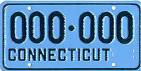 Circa. late 1950’s paint test plate. There was a whole series of these plates up for sale a number of years back – in all sorts of wacky color combinations. I only picked this one up. Despite the creative color schemes, the state settled for white on blue.
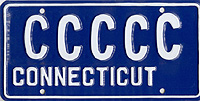 Mid 1960s (?) test plate. You can see the successive increase in the size and stroke of each letter ‘C’. I’m still trying to decide whether this was because of varying die sizes, or differing stamping forces used when embossing the letters.
 ca. 1980s prototype of some sort. The numbers have glass bead reflectorization.
 In the early 1980s, 3M made a large number of prototypes for many states. This particular one was made for Connecticut in 1983 in the same style as Vermont plates – the center section is slightly raised and the numbers are debossed. Continuing with the Vermont theme, this plate even has a tree in the top corner, in this case the Charter Oak.
 As if the previous plate weren’t close enough to Vermont yet, this one even uses the Vermont dies!
 Around 1986 the decision was made to return to issuing both a front and rear plate for each vehicle (only rear plates were issued starting in mid-1980). The DMV needed a way to distinguish which plates were issued in pairs and which were issued as singles- those issued in pairs needed both plates displayed on the vehicle, while vehicles issued single plates only needed to display a rear plate. One option was to add the year to the corner of the plate, similar to what Rhode Island had done in the past. This would become problematic after a while, because either the date would need to be updated every year, or the ’86’ plates would be issued for another 14 years or so.
 Here is a prototype of a fully-reflectorized plate in the traditional white-on-blue color scheme. This is again made with debossed numbers, similar to Vermont plates. Not a bad looking plate, easy to read, but we ended up with the light blue plates we see on the roads today.
 Another version of the above plate, with dies close to the standard Connecticut ones.
 Pretty close to the previous plate shown. There were many subtle color variations tested. This one is “8OP” while the previous one is “8T”.
 Americares prototype.
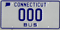 ca. 1987 fully-reflectorized Bus prototype plate. This was made on Massachusetts sheeting.
 How we know this was made with Massachusetts sheeting when it’s just plain white? The Ensure Mark (hologram) tells us!
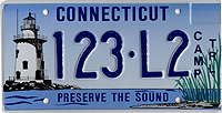 Camp Trailer “Preserve the Sound” prototype. The CAMP TRL legend on this plate is vinyl decals.
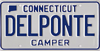 Some sort of 8-digit Camper mockup.
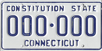
 Prototype map-base Combination plate.
The “Connecticut” legend has different dies, the blue coloring is very dark, and there is no glass bead reflectorization.
 ca. 1980s Combination prototype. The background is fully-reflectorized. Another oddity with respect to most Connecticut license plates is that this plate was made of galvanized steel, while Connecticut plates are typically made of aluminum.
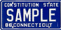
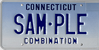
 When deciding on the design of new fully-reflectorized plates, consideration may have been given to this design which would maintain a look similar to the existing plates. Perhaps this design was too similar to the existing plates; Combination plates instead ended up looking just like passenger car plates except for the 4-letter stacked suffix.
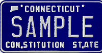
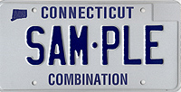
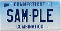
 It would appear that this would be the natural progression of the design of Combination plates if the blue-fade background was to be used. The embossed legend on the bottom of the plate denotes the type much more clearly than the small mixed-case wording printed on other non-passenger types. In addition, keeping the legend spelled out on the bottom would have avoided the need for the stacked C/O/M/B now used and kept the serial number area cleaner and a whole lot more legible.
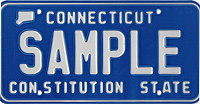
 Similar style but with the “Combination” legend screened instead of embossed.
![]() Late 1950s Commercial blank.
Late 1950s Commercial blank.
This one has a shipping label on the back from the Pennsylvania DMV. I’m not sure whether Connecticut made this plate for Pennsylvania, or vice-versa.
 1980s Commercial prototype.
This is a thin aluminum plate, and has “red” written on the back.
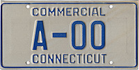
 ca. 1980s Commercial prototype, similar to the Combination one above.
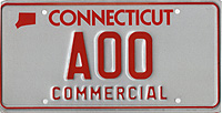
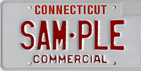 A Commercial prototype that is a mix of styles. The embossed “Commercial” legend carries on what was done in the past; the red-on-white color scheme also continues the then-existing style, the “Connecticut” font is that used on special-interest and Preserve the Sound plates, while the narrow dies used for the serial number were never used.
 DAV prototype. This one has the production sign-off on the back of the plate.
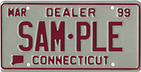 Dealer prototype dated 1999.
‘4801V Purple’ is written on the back.
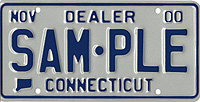 2000 Dealer prototype.
This plate is fully-reflectorized.
For actual issued plates, the glass beaded design held out for one more cycle until 2002.
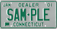 2001 Dealer prototype.
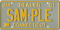 Another 2001 Dealer prototype.
Yellow on reflective silver probably isn’t one of the best color combinations.
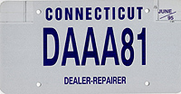 1995 Dealer-Repairer prototype. This is a flat plate made using the “digital technology” that many states are moving towards (and some are then moving back away from). Other than when brand new, these plates simply are not as easy to read as embossed plates once they have some wear and dirt or road salt on them. Not to mention they are quite easy to “spoof”- reasonable facsimiles seem like the real thing from a distance.
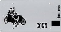 Fully-reflectorized Early American prototype blank. This style was never made with a reflective background.
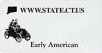 Early American prototype blank. This reverse of this plate is stamped Oct. 2000.
What better place to showcase modern internet URLs than on antique vehicle plates?
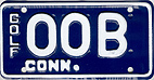 ca. 1960s Golf Cart prototype. Yes, Connecticut did issue plates to golf carts for a while. The usual colors were reversed from this, blue on white.
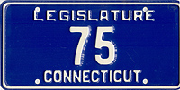 ca. 1975 Legislature prototype.
This has reflective glass beading on the white paint and was made either as the state was moving to the white Polyvend plates or when they were moving away from them.
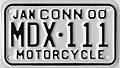 2000 Motorcycle Dealer test plate.
The prefix should probably be ‘MXD’ instead of ‘MDX’.
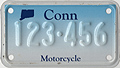 Motorcycle test plate.
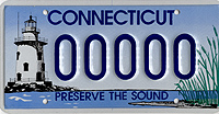
 Preserve the Sound prototype.
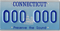
Thankfully we ended up with a slightly less plain plate.
 Very early prototype of the “Preserve the Sound” plate. This plate is actually painted onto the white back of a normal plate; it is not reflective sheeting like the following plates are. Thankfully the colors were livened up from this drab scene.
 Early prototype of the “Preserve the Sound” plate. The “Connecticut” is still black, but the “Preserve the Sound” caption has been added.
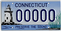
 Somewhat later prototype of the “Preserve the Sound” plate. Many small changes were made from this plate to the final approved design.
 Another “Preserve the Sound” prototype.
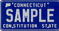
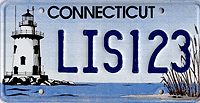
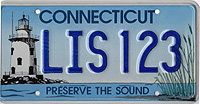
 Another later prototype of the “Preserve the Sound”. Getting pretty close now, one of the biggest differences is now the font.
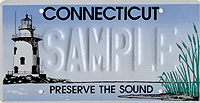
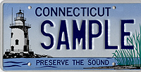 Similar style, with “SAMPLE” serial.
I had purchased an even later prototype, but it ended up in one of the numerous packages the postal service has lost for me recently. I had purchased an even later prototype, but it ended up in one of the numerous packages the postal service has lost for me recently.
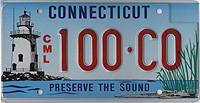
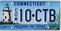 Preserve the Sound Commercial prototype.
Somewhat entertaining is the fact that the “.” was included in the stacked “COM” abbreviation.
 Preserve the Sound Commercial prototype.
The actual stacked legend ended up being “COMM” instead of “CML”.
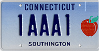 Prototype of a plate supporting the town of Southington.
Southington is home of the annual Apple Harvest Festival.
 Another Southington prototype, this time with the town seal.
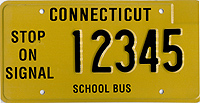 School Bus prototype.
There were many of these made with various slogans on the left. One of the biggest issues with these plates was that when the plate is the same color as the school bus, the plate kind of disappears into the background.
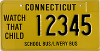 School Bus/Livery Bus prototype.
The School Bus/Livery Bus type was actually issued for a while in the same style as the light blue School Bus plates, but seems to have been discontinued.
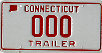 ca. late 1980s trailer prototype. This has a fully-reflectorized background.
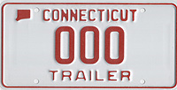 The same plate with the standard painted background and reflective beaded numbers.
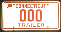 Here is what the first plate looks like when illuminated.
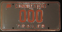 Here is the beaded variety. These two plates were side-by-side when the photo was taken. There is quite a difference – though it doesn’t help that the beading is applied to a dark colored paint. The white blotchiness you see is the excess beads applied during manufacturing. These would normally wash off after the first rainstorm or two.
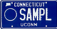 It looks like “optional” plates were considered before the fully-graphic plates became all the rage. Most likely a decal would have been placed in the circle to the right.
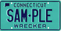 Prototype Wrecker plate.
It looks like they wanted a bold color for Wrecker plates for whatever reason. They settled for an orange background.